Showing posts with label Unit 85. Show all posts

Wednesday, 8 July 2015

Specialized Field

Specialized Field


Alice In Wonderland: Brief


Section One:

I am going to create numerous different illustrations that will be influenced by the artists I have researched. Each piece will be of a character from the novel or the Tim Burton film. I want my illustrations to show the juxtaposition of light and dark, and to possess an ethereal quality, much like the story and films of Alice in Wonderland.


Section 2:
My influences come from looking at different illustrators and experimenting with illustration myself. A big influence is combining light with dark, and in my case, creepy with ethereal beauty.
I have looked at numerous exhibitions that include illustration work, such as Lincoln University and Nottingham-Trent University, as well as the online portfolios of many illustrators. My idea’s come from looking at different styles of illustration as well as dot work artwork and tattoos.


Section 3:
I will be experimenting using different medium, such as paints, inks and pens, as well as on a variety of scales, and will also be incorporating some ideas from past developmental work, such as quick automatic sketches and idea planning to mixed media. 
I will start out by creating some small automatic sketches, which I will then change to my liking, which I will then develop using numerous different medium as well as moving the images onto Photoshop so that I can then edit them and develop them further.


Section 4:
I will evaluate my work by considering; How I feel about it, could it in any way be developed further, if not how could I have done it differently. This process will then allow to make room for either new pieces or the development of old pieces, and overall keep the design stage mo


Monday, 6 July 2015

Specialised Field

Specialised Field


Alice in Wonderland: Evaluation of Project


06/07/15


This project, for me, was mainly about decided the desired path I wanted to take. I never once had a firm idea that stuck for long before I either got bored or it just no longer appealed to me. Most of my ideas were based around set design, which then slowly moved to Costume which then rapidly changed to Illustration. I feel like there was steady movement through the numerous different fields I have looked at, and that they all, in some was relate to one and other. To begin with I was looking at castles, which then slowly moved to Illustration. The illustration I would be working on would then include different elements from each of the fields I researched.

I feel that it was necessary for me to look at all of the different fields for me to realize that what I most wanted to do was Illustration, as it helped me rule out all of the possibilities that I would have studied otherwise.

For my final piece I would create a large illustration that would be similar to a mural. It would tell the story by having one image to depict each of the entire chapters of the book. The illustration would solely be in black and white, however I would incorporate the smallest amount of colour in each image so that certain features of each illustration would stand out against the monotone background. The style I would use would be dot work, which I would use to create mildly realistic looking pieces, which I would then put into one image that would tell the story of Alice In Wonderland.
Doing this also allows me to incorporate the many different fields I have looked at, as I could then use the researched images and information to add to the illustrations, which would therefore tie all of my research together into one final piece.

Sunday, 5 July 2015

Alice in Wonderland

Alice In Wonderland


Looking At Illustrators


30/06/15


Hayao Miyazaki:


 I like his sketches because they are small and detailed, which is what I hope to achieve with my work. I do not wish to create huge pieces of work, only small illustrations without colour that have enough detail in them to show what they are and to tell part of a story


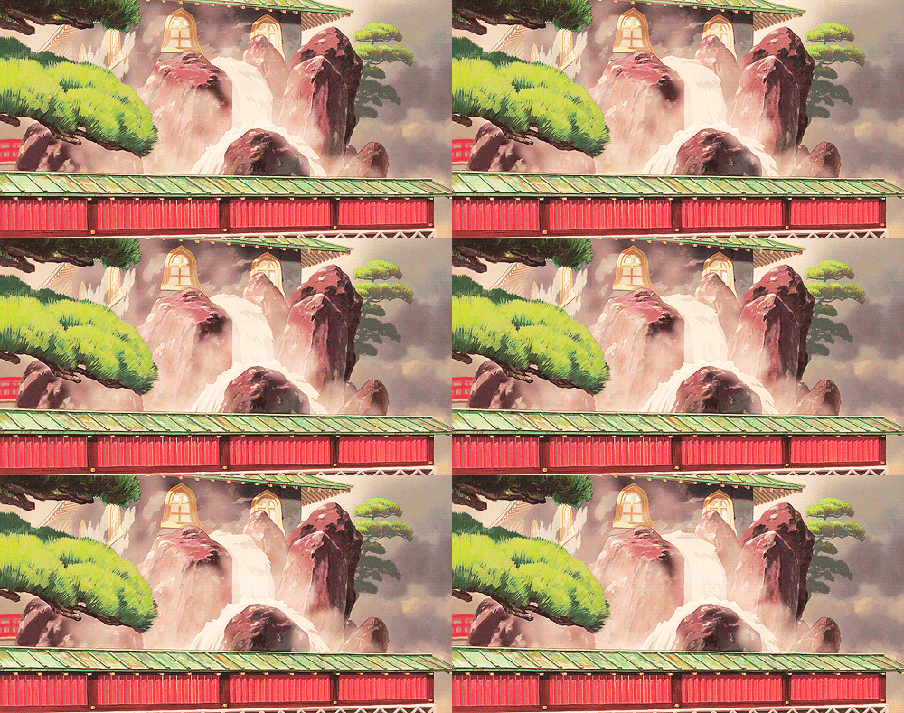
Hayao Miyazaki is best known for his work on the Studio Ghibli films such as 'My Neighbour Totoro', 'Spirited Away', 'Howl's Moving Castle' and many others. While he creates characters, I am more interested in the art in the background.

I am drawn to the detail he puts into his artwork and of how ethereal it looks, and also how, even though the style he uses means it isn't realism, it still has an element of realism in it.


Tom J Newell:

Tom Newell specialises in Illustration, and his work is mainly in black and white. It is bold and yet highly detailed even though he uses shapes to create an object rather than drawing the object itself.


I like his work because it focuses on the weird and the imaginative side of things. instead of just going with convention he goes against it. While a lot of my drawings lack imagination as I can only draw what I see in front of me or from an image, which I then adapt, I will use his style as an inspiration.

He Graduated as a conceptual artist and continued to draw in his style, drawing gig posters and things alike. His work is mainly in black and white however some pieces include colour. 


Iain Macarthur:


Iain Macarthur is a London based illustrator who works with pens, water colours and pencils and create Surreal pieces of portraits with embellished patterning around them. He graduates from Swindon college in HND Illustrations. In order to get his work some recognition, he began asking companies and art websites if they were interested in his work, while also posting his portfolio on behance.net
His inspiration comes from sitting down and taking in his surroundings, incorporating whatever catches his eye into a sketch. 


Mr Gauky:


I like Mr Gauky's work because of his incorporation of pastel colours. I also like his unusual images and strange drawings. 
He has been drawing for most of his life, stemming from creating and drawing things from a young age to dropping out of school and working jobs in which he's draw more than work. His friend saw his work and told his to go back to college, which eventually led to uni. He was highly influenced by skateboarding, which opened his eyes to print, and the use of limited colour schemes to create board graphics. 
A lot of research leads up to a piece and he find elements that interest him. He doodles until he likes what he has created and then he moves on to the lightbox.


Tim McDonagh:


Tim McDonagh uses a brush an Indian ink to create his pieces which he then colours up digitally. He values detail. He loves to draw grass.

Straight from University he became a freelance illustrator and won the D&AD new blood (D&AD Awards) and was then signed up to the Handsome Frank Illustration Agency. (Handsome Frank Illustration Agency (Hey)). He starts by drawing thumbnails which he then develops into more detailed and bigger version. After any necessary changes have been made, he then draws straight over it in Indian ink and rubs out the remaining pencil lines. The inks are then scanned into a computer and coloured digitally. HIs inspiration comes from the natural world and from decay.


David Bray:


David Bray has been a freelance Illustrator since his graduation from Central St. Martins in 1992. His preferred medium is pen or pencil on paper, however he is willing to experiment with new mark making techniques. Initially he wanted to be a graphics designer, and did a course in Graphics Design at Central St. Martins, however, after knocking on doors for work, he was turned down as a graphics designer but handed an illustration brief. He does rough sketches which he then experiments with until they feel right.




Wednesday, 20 May 2015

Alice in Wonderland

The evolution of my idea:


Set Design, Pottery and Hair and Makeup


20/05/15


My idea has changed numerous times and within a short safe of time due to the fact that I quickly become demotivated with each different idea I attempt. This is because with each idea I have come up with I haven't been that interested in, and so I haven't fully invested in the idea. 

My Different Ideas:


Set Design: Castle Re-Design:

The first idea I had was to re-create the two castles from the Alice In Wonderland film by Tim Burton. I wanted to create both castles in a way that would show the juxtaposition of light and dark, and that was also done in a beautiful manner. I quickly got bored of the idea, however.

Set Design: Aspects of the Castles:

After I decided that I no longer wanted to re-design both castles, I then went on to focusing on different aspects of the castles or sets. This then changed into another idea.

Set Design: The drink:

This idea focused solely on the drink within Alice in Wonderland, that, when ingested, caused the drinker to shrink. I was going to design a bottle, or vile, for the drink, and would also design the drink itself, using references for taste out of the novel. However, the drink wasn't going to taste of anything, but would represent the taste through colours and design. To do this, I was going to use liquid density and create my own drink.

Set Design: Packaging:

The bottle idea quickly changed into another idea, in which I would be creating packaging for different characters. This was the shortest lived of all idea's so far.

Set Design: Pottery:

For this idea, I would create different teacups and accessories for each different character that would be presented as part of 'The Mad Hatter's Tea Party'. This idea meant making many differently designed teacups. This idea had the most experimenting of all idea's, however I quickly got bored and demotivated, and hated the work I produced.

Costume Design: Hair and Makeup:

The latest of my idea's is to use make-up to recreate the different characters using models. I may create some small props to go with the character, however this idea sill needs a lot of thought.

Sunday, 10 May 2015

Alice In Wonderland: Set design

Alice and Wonderland: Set design


Pots and Packaging


10/05/15


My idea for this project has changed a lot, yet I have finally decided on what I want to create.

I will be creating a series of pottery, accessories and packaging to the Mad Hatters Tea party. To do this I will be creating various different teacups for each character, each with their own specific designs. I will also create a teapot with a universal design. As well as this, I will also hope to create some packaging for the food that would go with the tea party.

Painting clay:


To add some colour to the designs, I will be painting the teacups and anything also necessary. To do this, I will be painting the individual items using acrylic paints and then coating them in a clear acrylic spray to get the glossy effect. I will also be conducting numerous experiments using paints so that I might get a wider range of testing and options when it comes to painting the designs.

Each teacup will come with a small saucer that will carry the same design, and each design will be specified to each character I choose to use.


Tuesday, 17 March 2015

Alice in Wonderland: Set design

Alice in wonderland: Set design


Research: Potion Bottles and bottle shapes


17/03/15


 For my idea I wish to create numerous set pieces that show the magical qualities of 'Wonderland', and as well as doing this, i also want to stay with my original idea of showing the darkness and light within the story through the design of my pieces.
 this piece will be created using the 'Drink Me' potion from the books, or the 'Pishsalver' from the new film.

The qualities of this 'potion' cause the drinker to shrink in size, and has a very nice taste to it.

the bottle shown that contains the potion within the film is rather simple, and only has a label saying 'Drink me' on it, however, my aim for tho piece is to recreate the bottles shape and design so that it has an air of magic to it and also gives a glimpse of the taste through colour and design.
 To do this, I wish to create a bottle design that is not only elegant and looks pleasing and not at all suspicious, and that is almost inviting and makes the viewer want to drink it. I also feel that the bottle should be rather small to reflect the properties of the content within.

What I may do is buy numerous small glass bottles and build onto them with various different materials and paint them, as well as fill the bottle up with liquids.
 As part of the pieces design, I will also experiment with the colourations of liquids as well as the density of different liquids. The liquids need to look pleasing and not at all suspicious, and the colour needs to reflect the good taste.


Tuesday, 10 March 2015

Alice in Wonderland: Set Design

Alice in Wonderland: Set design


Research into mushrooms


10/03/15


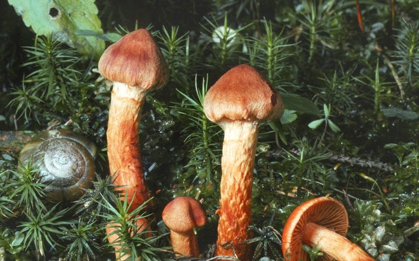
As part of my project, I wanted to research into various different species of poisonous mushrooms and toadstools so that I may get an idea of the coloration and shapes. The reason I have chosen poisonous species is because the coloration of them is sometimes otherworldly, which is the effect I am trying to achieve. 

Rather than trying to copy these mushrooms, I will eventually be coming up with my own designs using these as references.

The sea anemone fungus

octopus stinkhorn

Entoloma hochstetteri

bleeding tooth fungus

bioluminescent fungi

deadly webcap

devils bolete

false morel

fly argaric

fools funnel

jack o'lantern

Alice in Wonderland: set design

Alice in Wonderland: Set design


research


10/03/15


Since I have changed around my plan for this project, I will be doing some research within this session that is relevant to my plan. My research will be based on different types of mushrooms and poisonous toadstools that I will later be able to experiment with and incorporate into my designs.

Research:

- Different types/ Species of poisonous mushrooms and toadstools
- To create sketches of some of the mushrooms and toadstools that I am interested in and that I wish to incorporate into my work using the graphics tablets, and to later create some hand drawn sketches using different media (water coloured pencils, coloured pencils) (OUT OF SESSION)

In this session I have created a drawing using a graphics tablet as well as starting to create a sketch using water colour pencils.

Monday, 9 March 2015

Specialised Field

Alice in Wonderland: Salazem Grum and Marmoreal

Assessment brief

06/01/15

Section 1:
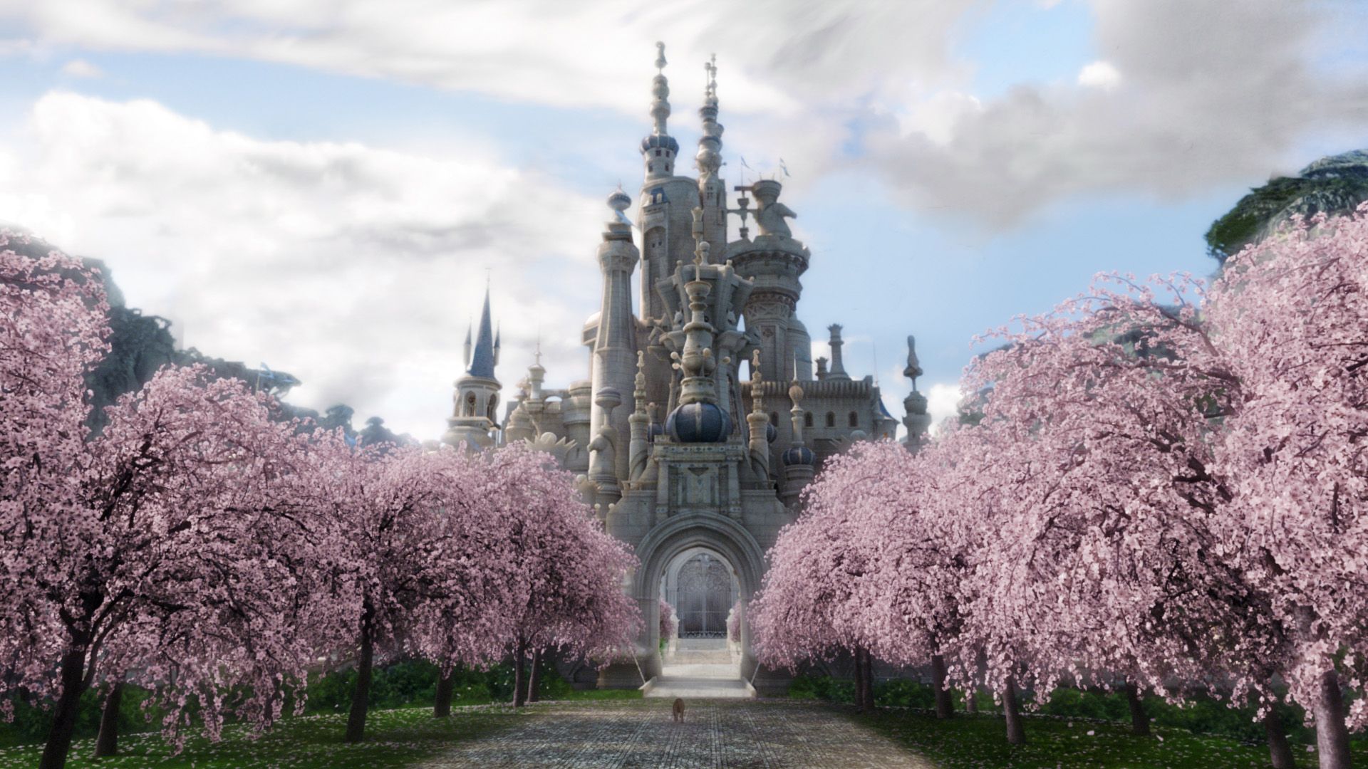
I am aiming to successfully show the juxtaposition between the two castles featured within Tim Burton's Alice in Wonderland: The castle of Iracebeth within Salazem Grum and Marmoreal. In extension, the sets related to both of these locations, such as the chess board.
I will include sketches and drawings of designs I have produced by looking at the buildings shows within the films, as well as architecture and designs that I myself will look at, photograph and incorporate. My overall aim is to produce something that will inevitably show the juxtaposition of Dark and Light.
To start with, I will carefully analyse different aspects of the two main locations and pick out anything about them that I feel show the juxtaposition I want to show by the end of this project, as well as any other aspects within the film that I feel will help project the dark and the light within it.
By the end of this project I will have created numerous sketches and designs as well as my own reconstructed models of both The Castle of Iracebeth and Marmoreal that successfully show the juxtaposition of Light and Dark.

Marmoreal


Salazem Grum
Castle of Iracebeth

The Chessboard

Section 2:

To help me complete this project I will be looking at various different buildings and the aspects of buildings that I will be able to tie into the designs I will compile and create. This will then help me progress in my reconstruction of  The Castle of Iracebeth, Marmoreal and The Chessboard. I will also research into blue printing, Architectual drawings  and Designers to extend my project further. As well as looking at actual buildings, I will also look at buildings, particularly castles, within films to get a broad range of styling that I can then experiment with and incorporate. Looking at different architecture throughout different countries will also be vital.

Neuschwanstein Castle
Germany

Mont Saint Michel
France

Prague Castle
Prague
Czech Republic

Windsor Castle
England
Castle Howard
England
Corfe Castle
England
Chateau De Chambord
France
Castillo de Coca
Spain
Kronborg Castle
Denmark
Catherine Palace
Russia


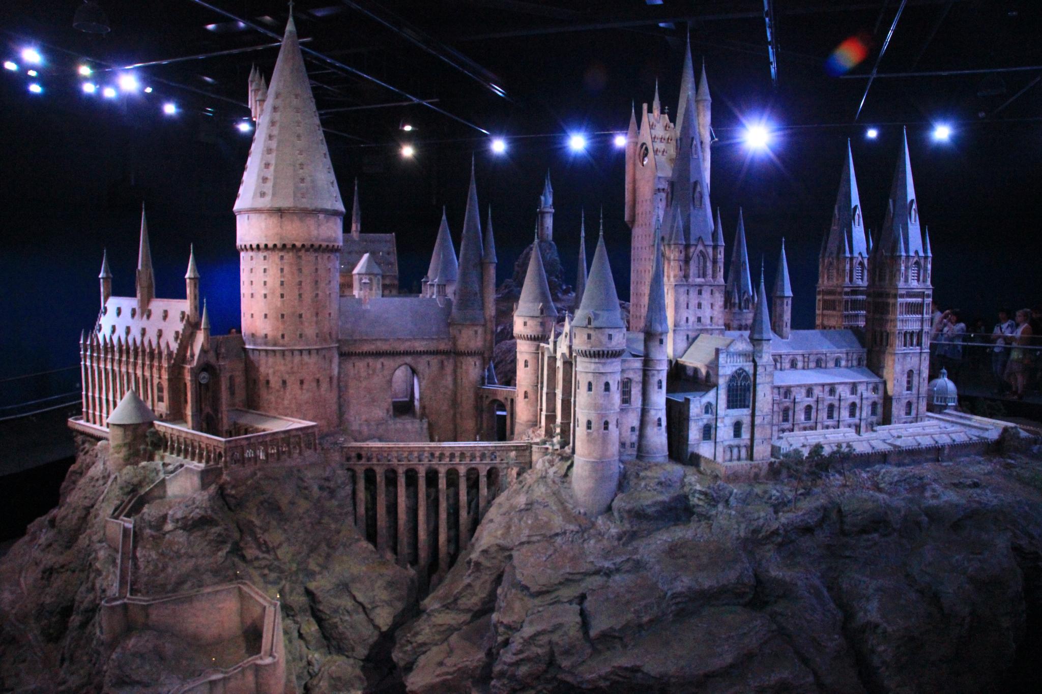
Hogwarts Castle
Harry Potter

Sleeping Beauty's Castle
America
Minas Tirith
Lord of the Rings

The imaginaruium of doctor parnassus

The Big Atures in Lord of the Rings

Harry potter world


Source 3:

Throughout this project I will have multiple sketches and idea's that will show the development of my work as well as small models of aspects of the design using multiple media such as wire, clay and cardboard. I will also create some graphical sketches on Photoshop using a drawing tablet. This will also allow me to test the materials for suitability and will then help me come to a conclusion upon which media I shall use. The sketches and the small models will then be put together to create an overall piece.

Section 4:

Notes:

As part of experimenting, I intend to use polystyrene and mod rock to create small models of buildings, as a way to experiment with media that will eventually link towards my final idea.

I will be using the polystyrene to make a 3D model by slotting pieces together that will then be covered in mod rock so as to strengthen it, and will be including detail when putting together the polystyrene.

I will be looking at the covering of cake dummies, as it is similar to my idea

Covering polystyrene cake dummies