Showing posts with label Unit 78. Show all posts

Tuesday, 23 June 2015

Illustration

Illustration


Continued Experimentation And Future Idea's


23/06/15


After working on a larger scale to create a painting using acrylic paints, I have decided to then marry together my idea of line illustration and fine painting by incorporating both into one piece. To do this I will still be using acrylics, as well as testing out a new technique in painting, but I will also be incorporating line drawing.

My idea is to create a piece in which someone is painting them self. The majority of the image would be done using acrylic painting, however a small portion will be in line drawings, as if the image hasn't yet painted itself. 

I will be using M.C Escher as a reference, who create a piece in which a hand was drawing a hand.


I will also be using the image below as a reference, as it slightly resembles what I am trying to achieve, only in a full painting, instead of a half paint, half illustration


Friday, 12 June 2015

Illustration

Illustration


experimentation: 3D, Graphics and 2D


20/05/15


After creating numerous illustrations using Jason Thielke and Lis Clements as inspiration, I realised that, while at first I was very happy with my drawings, they could use a lot of improvement. To do this, I abandoned the drawings for the time being and began to think about how I could improve the drawings. 
I wanted to use flowers and people so that I could make a collection of drawings that united both nature and mankind, even if in a minimal way. To do this, I began researching different types of flowers, focusing mainly on flowers like Peonies, Carnations, Ranunculus, and other flowers like this.  This also gave me an opportunity to try to loosen my drawing style so that I could become more expressive with my illustrations. 
Later, I thought about using different media, and having some 3D aspect within the illustration. So taking this idea, I began researching how to create paper flowers, and also experimented using fabric and tie dying material. 

The instructions to make the paper flowers were, at first, a little difficult to get my head around, however, after doing it how I thought it should be done, the instructions then became a lot clearer.
the end result was a little messy, however, for a first attempt, it was very good. 

The material flowers were little short of a disaster. I had made a flower using material once before, however it was a long time ago, and so the knowledge had slipped my mind, so I tried using different types of material, such as netting, a silky material and some regular scraps of material, I attempted to create flowers. 
The first few attempts were very bad, and quickly allowed me to figure out the capabilities of the different materials. The silky material was very useful in terms of making rose like designs, however the other materials were either too stiff or too heavy and so provided no structure to the designs.

As well as experimenting with different 3D materials, I also experimented using 2D materials, such as Acrylic paint, Graphic markers, Water colours, pen and pencil.

Tie dying:

The tie dying was relatively easy. I used a canvas material and tied it in different ways and then soaked it, so that the dye would absorb easier. I then put two different pieces of material into both a bucket of red and blue dye, poked it down using a stick so that I was sure it was all covered, and then left it for about 30 minutes. The red dye took a lot more to the material than the blue dye, as the blue dye washed off, and I learnt that folding the canvas didn't work. Next time, I would also use a different material, as due to the canvas' almost waterproof properties, where the material was folded, no dye for into that area.

Illustration

Illustration


Painting and portraits


10/06/15


To further my experimentation, I will be using acrylics to paint acanvas. Instead of using the same style I used to create my previous illustrations, I will be painting from a photo, and will be aiming for realism. I am still trying to incorporate my theme of "nature and people" and so will be incorporating flowers and other elements of nature into the drawing.

The first step of the whole process was to cut out a sheet of canvas to  my preferred size and then prime it. After this I could then begin sketching out the image I wanted to paint, looking at a photograph for reference. It took a while to get the proportions right, however, I eventually managed to get the drawing to how I wanted it. Once I had done this and checked the proportions, I could then begin to paint. Getting the right skin tone was a little difficult at first, and still needs changing a little, and the blending of shadowing was the most difficult part, however, I intend to paint the entire face, section by section, so that I will be able to then start adding more shadowing after to add more dimension to the face.

To further my experimentations I will research into other portraiture artists and look at their style and preferred waay of painting, so that I may try and develop my own style.

Illustration

Illustration


Research into portraiture and painting


11/06/15


As part of my experimentation and developmental work for this project, I intent to use numerous different media to build up a portfolio of experiments. As I have not yet used acrylic, and was keen to try, I will be looking at various different portraiture artists and their techniques and will try to incorporate some of them, or at least develop my own style using my research.

Charmaine Olivia:
http://www.charmaineolivia.com/

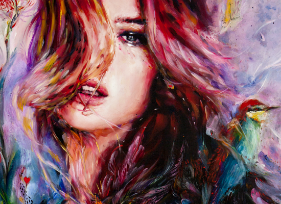
Charmaine Olivia uses a lot of colours and creates pieces with an ethereal image. Her work incorporates as much colour as possible, as well as elements of nature, such as flowers and water, as I wish to do. The people she paints are all female and all have some ethereal qualities, such as their beauty. She paints well known faces as well as people she creates. The faces of her subjects are flawless at first glance, and the brushwork is very obvious surrounding it.


Zaria Foreman:
http://www.zariaforman.com/

While Zaria Foreman does not specialise in portraiture painting, her talents lay in painting water, which I will be hoping to incorporate into my own artwork. She works in large scale and puts detail slowly into everything she produces. She specialises in Realism.


Marisa Parga:
http://www.marisaparga.com/

Marisa Parga uses water colours, and are less flawless. You can see the blocks of colour used and the over laping colours within her work.


Sunday, 26 April 2015

Illustration

Illustration


Unit 78


23/04/15


After the illustration project for Unit 12 finished, we were then able to go our own way in terms of development, characters and idea's. We were no longer limited to using inanimate objects as our characters, nor were we to create a story. The unit that Illustration had been moved to, Unit 78 (realizing fine art ideas) meant that we could do whatever we wanted, and that it showed the development of out artwork. 

The style that I have adopted is a mixture of Jason Thielke, who drew directly in one continuous line, and Liz Clements, an Illustrator. Both artists use portraits, particularly women, as a focus.

 Jason Thielke's work consisted on hand drawing these portraits directly onto wooden panels, all the while using a continuous line to do to, while adding finer detail later.

I've taken the idea of using a continuous line, while looking at the different positions he would draw the model in, and tried to make my own twist on it.


Liz Clements style is a lot neater and clean cut, using ink to create flowing lines. Her line drawings are later coloured up by other means, however, sometimes, a little colour is added before hand. Once again I am taking inspiration from her by looking at her line work, however, my main focus is on the position of the heads.


Tuesday, 10 February 2015

Learning resources


Learning Resources:


Hair and Beauty
Paint by numbers

9/10/14


Once again, we were asked to pair up for a project, only this time, instead of all following one topic, we were each given a sub-topic within the main project.

The aim of this project was to produce a learning resource under a particular subject that would be engaging and simple for those who learnt in a different way to what others do. Once again the project was for a client.Me and my partner were given Hair and Beauty as out sub-topic, and while it seemed at first to be a rather simple task, it has proved to be a lot more than what I expected. At first coming up with initial idea's was rather limited as both me and my partner really didn't have a clue as to what would happen in a Hair and Beauty course, however, we managed to come up with a finalized idea. However, under instruction of our mentor, we were all asked to set aside the work we had already done and start up from scratch, so that we could gather resources and research to expand and develop what we had already done, so that we could look back at our original idea's and add to them, or completely change them.

Since we are doing Hair and Beauty, we have decided, at the moment to focus on the eyes, as that is what most of our idea's have been revolving around, so my research was to find images or resources that showed how to draw eyes of different shapes, as most of our designs have all followed one particular style. I also looked into how to draw lips of different shapes, as we would then begin to experiment and break past the wall of drawing the same things. Continuing on our eye design, however, I found some images that show rather strange and bold eyelashes, which is what we had decided to try and do.


Original idea's


Resources


This image will give me an idea with how to experiment different eye shapes and patterns


The colour is bold and helps me to come up with a colour scheme or an idea of how I want the image to look


Reference for experimentation with lip shape


This image is interesting and shows that, while it isn't what someone would generally do, it is still considered as beauty. The idea of the spidery lashes and the flowers surrounding it widen the parameters and allow for more experimentation.


I like this image because it gives me a #n idea of how I could draw a simple eye, but at the same time, I would be able to include detailing such as reflections and colouring.


Finally, I found an image that, rather than showing me how to draw something, gave me an idea, as it demonstrated how to do something. I thought of it as a new take on the project, and, instead of just having an eye drawing, or something similar, have something that would be as equally engaging and yet would also be rather beneficial


This image shows me how I could highlight and tone a face if I were to draw one, and so is extremely useful.


Tuesday, 18 November 2014

Fine Painting, NNC Peace Room

Abstract

research into colour theory

17/11/14

What is Abstract:
Something that exists in  thought or as an idea but not having a physical or concrete existence.
A piece of artwork that, rather than using objects, uses shapes, colours and textures to achieve its affect.
Colour harmony, the colour wheel and the context of how colours are used all fall under the category of colour theory.

Colour harmony represents the unity and satisfying balance between colours, which, to the human eye are aesthetically good to look at. Colour harmony, to be achieved, relies on knowledge of hue, value and chroma.

Colour harmonies:


Monochromatic: 

harmony uses same values (tints, shades and tones) within the same colour family


Analogous:

harmonies are created using three or more colours that sit side by side on the colour wheel


Complementary:

colours are those that appear directly opposite on the colour wheel


Split Complementary:

Colour arrangement results from one colour paired with two other colours on either side of the colours direct complementary colour, completing a scheme of three colours.


Double Complementary:

Harmonies include two sets of direct complentary colours sat next to each other on the colour wheel forming an 'X' shape.


Tetrad:

combinations are made up of four hues of equal distance from each other, forming a square or a rectangle on the colour wheel.


Diad:

Schemes are made up of two colours two steps apart, skipping the colour in between.


Triad:

A combination of three colours of equal distance from each other, forming an equilateral triangle on the colour wheel.


Primary and Secondary colours


The primary colours consist of Yellow, Red and Blue. Mixed together, these colours then create the Secondary colours, Purple, Orange and Green, which, in different shades, then begin to form the complementary colours on the colour wheel. 


 Howard Hodgkins


He is a British painter and print-maker born in 1932 and is mostly associated with Abstraction. He came up with the Push and Pull theory, in which he used different colours and shades to show how some things would catch the viewers attention more that others within one painting.


For example, most would think that because the square is much bigger, attention would be drawn to that shape first, however, due to the vivid colour of the small dot, it is in fact that shape that pulls the attention to it, rather than the square.


Sunday, 16 November 2014

Fine Painting- Artwork for the NNC Peace Room

Initial Reasearch


Reference Images


16/11/14


The NNC Peace Room is for the whole college community, and is a small room available for prayer, quiet and meditation. The artwork must not include any references to living things or objects as some who use the room may consider that they are then worshipping idols. They must be neutral and not be directed to one faith more than another.

While it is importaint not to create any pieces with a clear object or thing within it, as practise, we were to research images of landscapes so that we could dismantle and re-arrange into something abstract and that no longer looked like the image it was before. 


While the images I have found are all natural, I do feel that each of them possess an abstract aspect, and that the colours and shapes within them will help me with my work.

As an idea, I thought about using sounds to construct a piece that I felt the sounds would look like if they were solid.

Tuesday, 21 October 2014

Claymation

Claymation

Evaluation of photo taking process


21/10/14


While we only had one session in which to complete the photo taking part of our claymation, we had managed to complete two scenes to the best of our abilities using the supplies that we had. There are a few scenes that need editing, however out of the images taken, some will be taken out as they are unnecessary or of bad quality. All that is left to do is to put the photo's into editing and make one long video using them while will be completed with effect and music.

Thursday, 9 October 2014

Health and well being


Health and Well-being

Medical room

09/10/14


For our first project, we have been asked to split into groups and create artwork that promotes healthy living for a client. The artwork is to be put up in a medical room, and so needs to be eye-catching to the people who would go in there. 
Me and my partners have been sketching out idea's and have eventually come up with a theme of a healthy mind-set that would lead to a healthy life. The style that we have been experimenting with is almost 'old school' tattoo's, however we are continuously coming up with new idea's and are slowly moving away from that idea. Main theme's include positive quotes and hands, and the media in which to create all final pieces in has yet to be determined, however, it seems that graphics is the most circulated and thought of media.
Rather than having a plain poster with one piece of work in the middle, we have decided to try to make a collage of pieces in one, so as to add colour and to make it a little more eye-catching, but not over-crowded.
Eventually, we plan to have many of our idea's made into posters and badges, so that we have many of our idea's being used and to give a little variety. The will probably only be one poster design, and the rest will be used as badge designs.


Initial Idea's