Image Manipulation
One Day Project: National Geographic
15/06/15
For this one day project, we were instructed to take a photo, or multiple photos of ourself and to manipulate them, whilst included some techniques, such as soft portraiture effects.
The idea of this project was to introduce some new techniques and put them into practice so that we would know how to use them in the future, and it was also to create some artwork that would go into an exhibition for the foundation and second year students.
The National Geographic was used as a template for the entire piece. There were some strict requirements that were to be met, as all pieces made would be put together for the exhibition and so had to have the same font, size, spacing and all images used had to have a white background.
 The head title of each piece could be anything, and so we weren't restricted with this, as long as it fit the font and size requirements and fit into the correct space. The small statement underneath the title could also include anything within reason, as long as it included your name and also fit the requirements.
I created four designs, and with each I tried using multiple different effects. The first effect I used was Gaussian Blur, which would help to create an airbrushed effect, which is often used in industry to make things look better and to make facial features less harsh, therefore making people look more attractive.
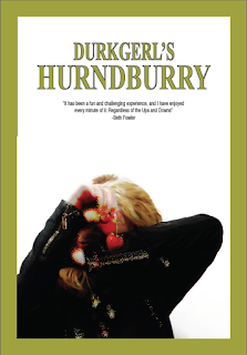
The first design I created was the red one, which was the most difficult to figure out. Once I had done the effects and managed to meet the requirements for the piece, I could then begin to experiment using different filters. The second piece I created was the green one, which I experimented with using the Filter Gallery in photoshop. With this I used a ripple effect, changed the size and erased some of the parts that I didn't want, or that I wanted to make stand out.

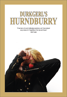
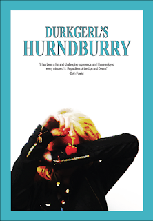
The third piece I created was the brownish one, which I once again went into the filter gallery and used the mosaic tile effect. For the blue piece I mainly experimented with curves rather than any filters. This gave it a colourful twist.
My chosen piece was the green one because of the colours and the effect.
For each piece, the writing and the border colour was taken from a colour somewhere inside the image I had used.
My chosen piece was the green one because of the colours and the effect.
For each piece, the writing and the border colour was taken from a colour somewhere inside the image I had used.
How to create a soft portraiture effect:
The first thing I had to do was to change the levels and curves within the image, and crop anything out that I didn't want. Because one of the specifications was to have a white background, this would mean cropping out anything in the image background that wasn't white or that couldn't be changed through selective colour to white.
 |
| Once this was done, the image was to then be duplicated twice. |
 |
| Once the image was duplicated, the copies were then to be renamed, the first copy 'Lighten', and the second copy 'Darken'. |


No comments:
Post a Comment